An interpreting linear graphs worksheet should help students focus on what the graph means, not just how to draw one. The best practice asks learners to read slope, y-intercept, rate of change, and key points in context. That means noticing whether a line goes up or down, what the starting value is, and how much changes per unit. Clear questions make graph reading more accurate and more meaningful.
Read the graph features
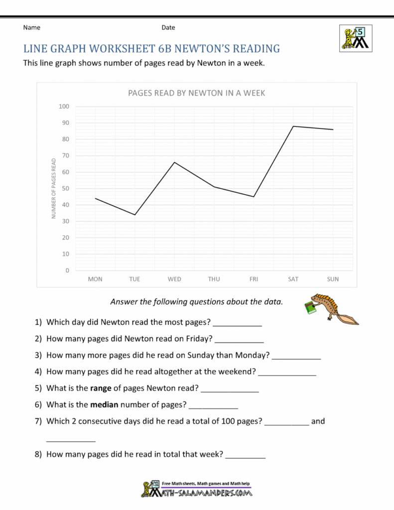
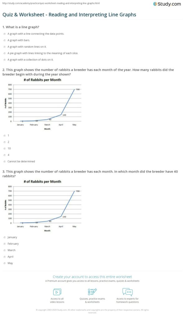
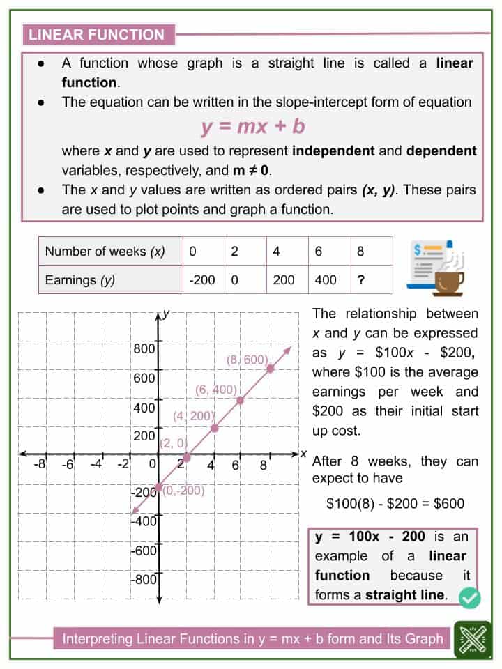
A strong worksheet first teaches students to identify the parts of a linear graph. The y-intercept shows where the line starts on the vertical axis, and the slope shows the constant rate of change. A positive slope means the line increases; a negative slope means it decreases. Students should also read rise over run from two points on the line. These basic features give the first clues for interpreting the situation correctly.
Connect to context
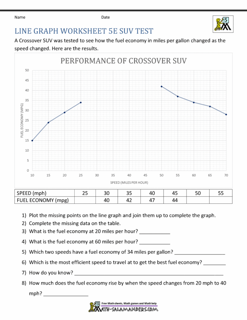
The next step is turning graph features into word-problem meaning. For example, if the y-intercept is 10, that is the starting amount at time zero. If the slope is 3, the value increases by 3 each unit. A good worksheet should ask what a point represents, what the line means in a story, and how two situations compare. This keeps the focus on interpretation, not just labels.
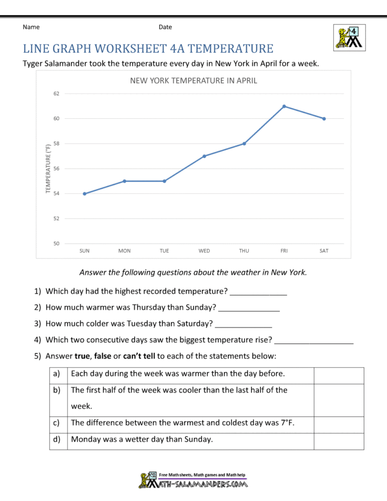
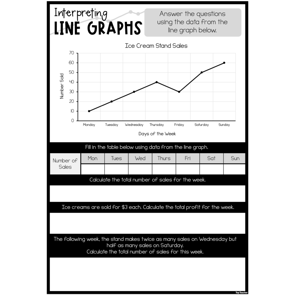
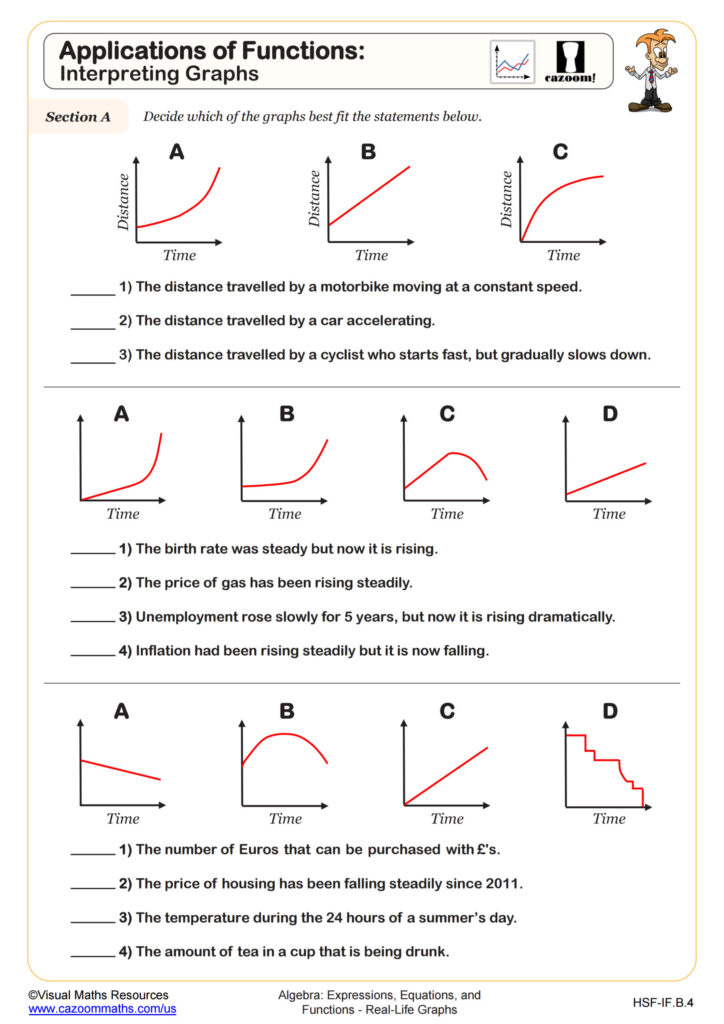
For practice, include short prompts such as “What does this point mean?” “Is the graph increasing or decreasing?” and “Which line has the greater rate of change?” Answer-checking cues should push students to use evidence from the graph, like the intercept or the rise and run between points. Simple comparison items work well because they reinforce meaning without adding advanced algebra. A useful worksheet ends with students explaining the graph in one sentence.