Detailed coloring pages for adults are usually defined by dense linework, layered patterns, and enough small spaces to keep the page visually active without becoming cluttered. The best pages feel intricate at a glance and still leave room for color choices to stand out. When you are browsing a set, look for designs that balance complexity, clear outlines, and a subject you actually want to finish.
What Makes Them Detailed
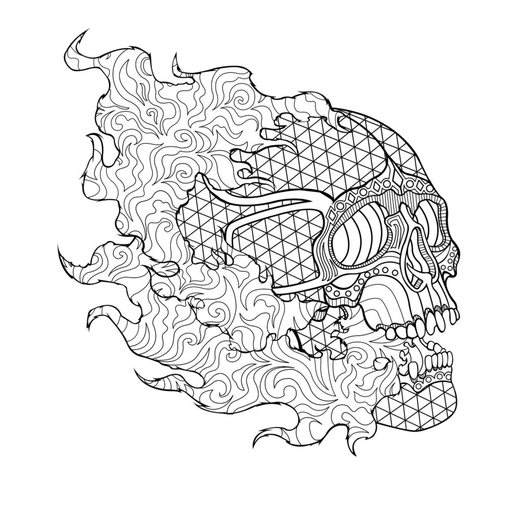
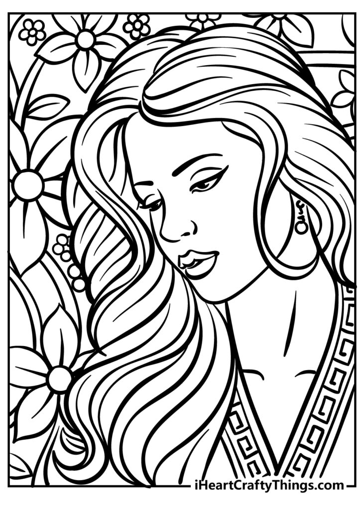
Adult pages tend to feel detailed when they combine multiple visual textures in one image. Think mandalas with repeating rings, florals with leaves and petals, animals wrapped in decorative patterns, or fantasy scenes filled with background elements. Good detail is not just “busy”; it creates varied areas to color, from larger focal shapes to tiny accents. That mix helps a page stay engaging and gives you more ways to use shading, blending, or simple flat color.
Choosing a Useful Set
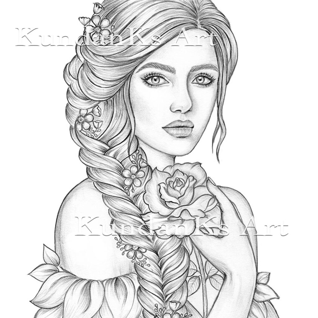
A practical set should be printable in a clean format with crisp black lines and enough contrast to stay sharp after printing. Page complexity matters too: some designs are highly ornate, while others are detailed but still open enough for colored pencils or fineliners. If you like markers, look for pages with stronger line spacing and paper that can handle bleed-through. A useful collection also offers variety, so you are not repeating the same motif on every page.
Common themes include mandalas, floral bouquets, animals, fantasy creatures, geometric abstractions, and nature scenes with leaves, feathers, shells, or stars. These subjects work well because they naturally support repetition and fine detail. Many adults also prefer collections that mix symmetrical pages with freer compositions, since that creates a better rhythm across a book or printable set. If you are choosing for a calm, focused session, a theme with consistent visual density usually feels more satisfying than a sparse design.
For the best results, print detailed pages at the highest sensible quality setting and use a paper weight that matches your tools. Standard printer paper works for light pencil use, but heavier paper is better for markers or layered color. Check that the line art is dark enough before you start, because faint outlines make intricate sections harder to follow. If you want smoother results, print one test page first, then adjust scale or quality before working through the rest of the set.